


Content ITV PRO
This is Itvedant Content department
Learning Outcome
5
Apply borders, overflow, shadows, and opacity.
4
Understand and implement CSS Box Model.
3
Create gradients for attractive visual designs.
2
Use background properties for webpage styling.
1
Apply various CSS color formats effectively.
CSS supports 147 predefined color names like red, blue, green, coral, tomato.
Hexadecimal values starting with #. Format: #RRGGBB where RR=red, GG=green, BB=blue (00 to FF).
p { color: #ff0000; } /* red */
h1 { color: red; }
CSS supports 147 predefined color names like red, blue, green, coral, tomato.
Hexadecimal values starting with #. Format: #RRGGBB where RR=red, GG=green, BB=blue (00 to FF).
p { color: #ff0000; } /* red */
h1 { color: red; }
Named Color Swatches
red
blue
green
orange
yellow
CSS supports 147 predefined color names like red, blue, green, coral, tomato.
Hexadecimal values starting with #. Format: #RRGGBB where RR=red, GG=green, BB=blue (00 to FF).
p { color: #ff0000; } /* red */
h1 { color: red; }
HEX Breakdown
#ff000
RR -> ff
GG -> 00
BB -> 00
#f00
Short form equivalent
RGB & RGBA
Defines colors using Red, Green, Blue values (0–255).
color: rgb(255, 0, 0);
RGBA adds alpha transparency (0.0 to 1.0).
color: rgba(255, 0, 0, 0.5);
HSL & HSLA
Uses Hue (0–360°), Saturation (0%–100%), Lightness (0%–100%).
color: hsl(0, 100%, 50%);
HSLA adds alpha transparency.
color: hsla(0, 100%, 50%, 0.5);
background-color : lightblue;
background-color
Sets background color.
background-image: url('bg.jpg');
background-image
Adds image as background.
background-repeat: no-repeat;
background-repeat
Controls image repetition.
background-size: cover;
background-size
Controls image size.
background-size: cover;
background-position
Sets image position.
Creates smooth color transition in a straight line. Direction can be specified (to right, to bottom, 45deg, etc.). Default direction is top to bottom.
Creates circular gradient effect radiating from the center point. Shape can be circle or ellipse.
Creates gradient with color transitions rotated around a center point. Ideal for pie charts and color wheels.
Every HTML element is treated as a rectangular box with four layers:
Margin
Border
Padding
Content
Every HTML element is treated as a rectangular box with four layers:
Margin
Border
Padding
Content
Margin is the transparent space outside an element's border that creates distance between the element and surrounding elements.
Every HTML element is treated as a rectangular box with four layers:
Margin
Border
Padding
Content
Border is the line that surrounds an element's padding and content, used to define its visible boundary.
Every HTML element is treated as a rectangular box with four layers:
Margin
Border
Padding
Content
Padding is the space between an element's content and its border, used to create inner spacing within the element.
Every HTML element is treated as a rectangular box with four layers:
Margin
Border
Padding
Content
Content is the actual data inside an element, such as text, images, or other HTML elements, displayed within the content area of the CSS Box Model.
Control element dimensions and how the box model calculates size.
/* Explicit dimensions */
width: 300px;
height: 200px;
/* Constrain sizing */
min-width: 200px;
min-height: 500px;
max-width: 200px;
max-height: 500px;
/* Include padding & border */
box-sizing: border-box;
Control element dimensions and how the box model calculates size.
Controls the width and height of an element.
/* Explicit dimensions */
width: 300px;
height: 200px;
/* Constrain sizing */
min-width: 200px;
min-height: 500px;
max-width: 200px;
max-height: 500px;
/* Include padding & border */
box-sizing: border-box;
Control element dimensions and how the box model calculates size.
| Sets the minimum height and width an element can have. |
/* Explicit dimensions */
width: 300px;
height: 200px;
/* Constrain sizing */
min-width: 200px;
min-height: 500px;
max-width: 200px;
max-height: 500px;
/* Include padding & border */
box-sizing: border-box;
Control element dimensions and how the box model calculates size.
| Sets the maximum height and width an element can have. |
/* Explicit dimensions */
width: 300px;
height: 200px;
/* Constrain sizing */
min-width: 200px;
min-height: 500px;
max-width: 200px;
max-height: 500px;
/* Include padding & border */
box-sizing: border-box;
Control element dimensions and how the box model calculates size.
/* Explicit dimensions */
width: 300px;
height: 200px;
/* Constrain sizing */
min-width: 200px;
min-height: 500px;
max-width: 200px;
max-height: 500px;
/* Include padding & border */
box-sizing: border-box;
box-sizing controls how an element's width and height are calculated, including padding and borders.
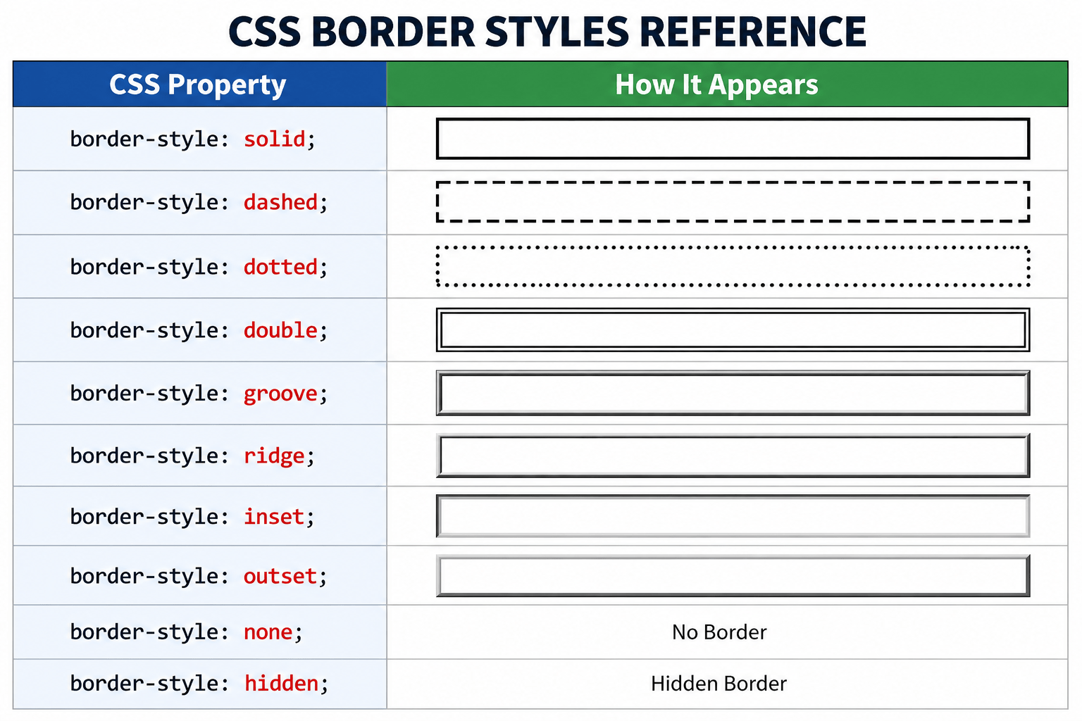
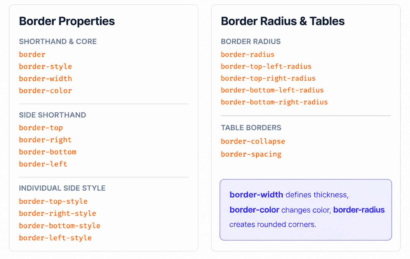
CSS borders are used to create boundaries around HTML elements.
Borders can control: Style , Width , Color , Rounded corners
border-style
Defines the style/type of border.
border-style : solid ;
border-style : dashed;
border-style : dotted;
border-style : double;
border-style : groove;
border-style : ridge;
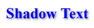
Adds shadow to text elements for depth and emphasis.
text-shadow: 2px 2px 5px gray;
2px right offset
2px bottom offset
5px blur radius
gray shadow color
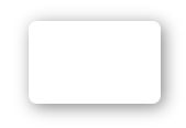
Adds shadow around elements for elevation effect.
box-shadow: 2px 2px 10px gray;
2px left/right
2px top/bottom
10px blur softness
gray spread color
Controls transparency level of entire element. Range: 0.0 (fully transparent) to 1.0 (fully opaque).
1.0 Fully opaque
0.5 50% transparent
0.2 20% Mosty transparent
0.0 Fully transparent
Summary
5
Borders, shadows, and opacity improve visuals.
4
Box Model controls element sizing and spacing.
3
Gradients create smooth color transition effects.
2
Background properties enhance webpage appearance significantly.
1
CSS supports multiple color representation methods.
Quiz
Which CSS property creates rounded corners on an element?
A. border-style
B. border-color
C. border-radius
D. border-width
Which CSS property creates rounded corners on an element?
A. border-style
B. border-color
C. border-radius
D. border-width
Quiz-Answer
By Content ITV


