A Bootstrap Journey

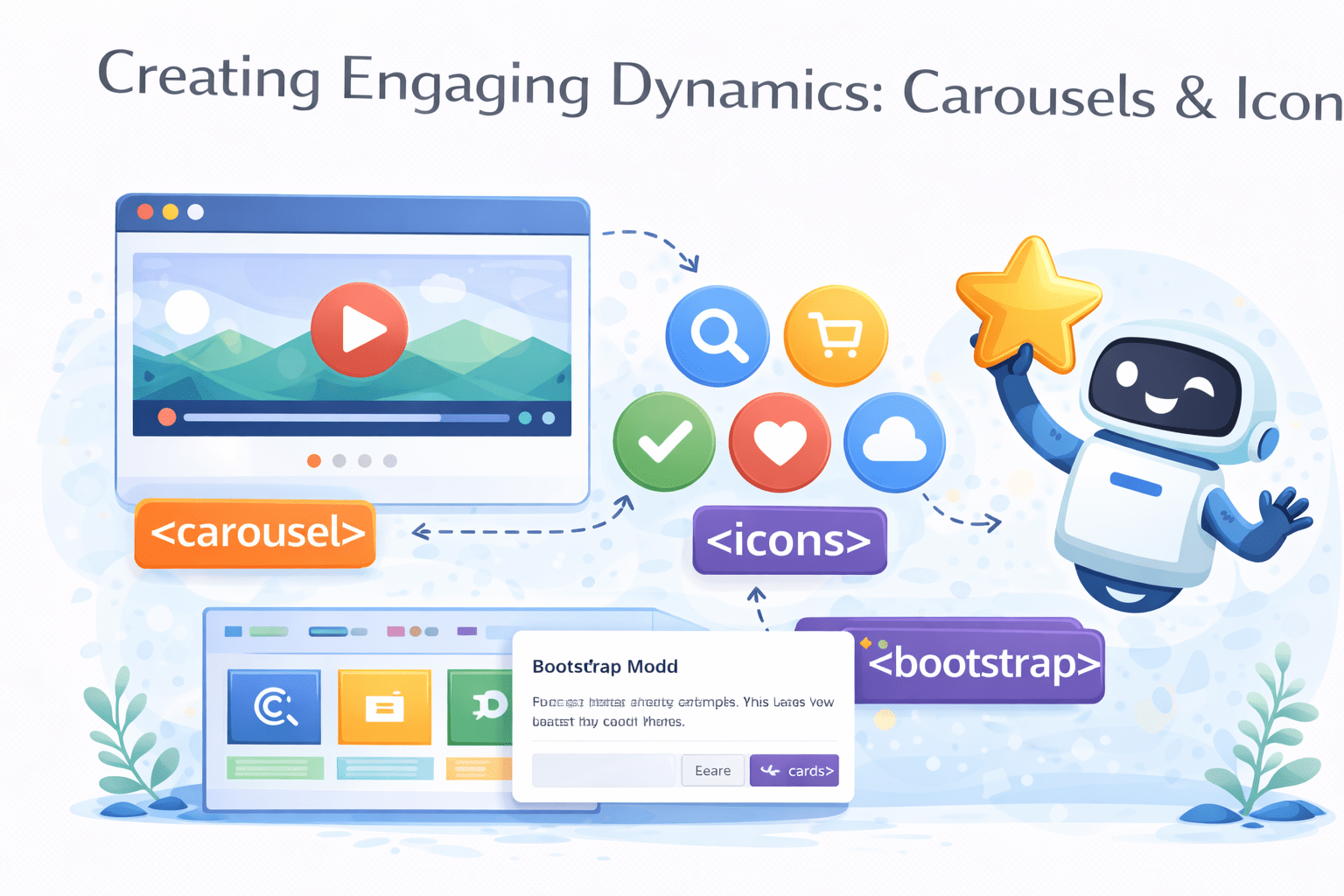
Creating Engaging Dynamics: Carousels & Icons

Learning Outcome
1
What is Carousel in Bootstrap?
2
How to add icons from the icon library?
3
How to add navigation components like footer?
Let's Add The Featured Anime's In The Website Using "Carousel"
Carousel: A carousel is a rotating set of images or content on a webpage
How Is The Carousel Component Strutured?
Carousel Container
Class = "Carousel slide"
Class = "Carousel inner"
Carousel item 1
Carousel item 2
Prev button
Let's Explore The <div> Inside Each Component
Individual "carousel-item" divs for each slide
Carousel inner
Carouse container
"carousel-slide" div the main container
How To Insert & Customize Images In Carousel?
Using the <img> tag within each "carousel-item" div
<div id="carouselExampleInterval" class="carousel slide" data-bs-ride="carousel">
        <div class="carousel-inner">
            <!-- carousel with setinterval -->
            <div class="carousel-item active" data-bs-interval="4000">
                <img src="https://wallpapercave.com/wp/wp5493855.jpg" class="d-block w-100" alt="..." />
            </div>
            <div class="carousel-item" data-bs-interval="4000">
                <img src="https://wallpapercave.com/wp/wp7091939.jpg" class="d-block w-100" alt="..." />
            </div>
            <div class="carousel-item" data-bs-interval="3000">
                <img src="https://wallpapercave.com/wp/wp13506187.png" class="d-block w-100" alt="..." />
            </div>
            <div class="carousel-item" data-bs-interval="2000">
                <img src="https://wallpapercave.com/wp/wp11466962.jpg" class="d-block w-100" alt="..." />
            </div>
            <div class="carousel-item" data-bs-interval="1000">
                <img src="https://wallpapercave.com/wp/wp12984716.jpg" class="d-block w-100" alt="..." />
            </div>
        </div>
<div class="carousel-item active" data-bs-interval="4000">
Represents individual slide
Defines a single item in the slide
Makes specific item first visible slide when page first loads
Sets the interval of the slide before moving to next
<img src="https://wallpapercave.com/wp/wp5493855.jpg" class="d-block w-100" alt="..." />URL of the image to be displayed
This "display block" class makes the image take up the full width making it block element
Makes the image width 100% of its parent container
Provides alternate text to the img, if it fails to load

How To Navigate To The Carousel Component In Bootstrap?
Go to "Components"--> "Carousel" --> Individual .carousel-item interval
How Can To Navigate Through Different Slides Of Carousel Using Buttons?
What Options Do Carousel Controls Have?
<button> element is used to create a control for navigating to "Next" & "Previous slides"

Adjust button positioning and size
Style prev/next buttons with custom icons
Customize transition effects
Add or remove slide indicators
Let's See The <button> Element In Action
<button class="carousel-control-prev" type="button" data-bs-target="#carouselExampleInterval"
            data-bs-slide="prev">
            <span class="carousel-control-prev-icon" aria-hidden="true"></span>
            <span class="visually-hidden">Previous</span>
        </button>
        <button class="carousel-control-next" type="button" data-bs-target="#carouselExampleInterval"
            data-bs-slide="next">
            <span class="carousel-control-next-icon" aria-hidden="true"></span>
            <span class="visually-hidden">Next</span>
        </button>
    </div>
<button class="carousel-control-prev" type="button" data-bs-target="#carouselExampleInterval" data-bs-slide="prev">
Creates control for navigating to slides
Styles the button as a control for moving to the previous slide
Specifies that this element is a button
Specifies the target carousel for this control button
ID of the carousel that this button will control
This button moves the carousel to the previous slide when clicked
The value prev indicates the direction of movement
<span class="carousel-control-prev-icon" aria-hidden="true"></span>
            <span class="visually-hidden">Previous</span>
Provides a default icon to the button
Hides the element for screen readers
Hides the text visually but makes it available to screen readers
Provides a descriptive label for the button
It's Time To Add A Footer
How To Implement Footer In Our Website?
Go to search bar --> Navigation --> Select the second component
Here the card component is used to create a footer like structure
Before this, Let's Take A Look At How To Include Icons In Bootstrap

Upward arrow icon is used inside the footer

How To Import Icons In Bootstrap Via CDN Link?
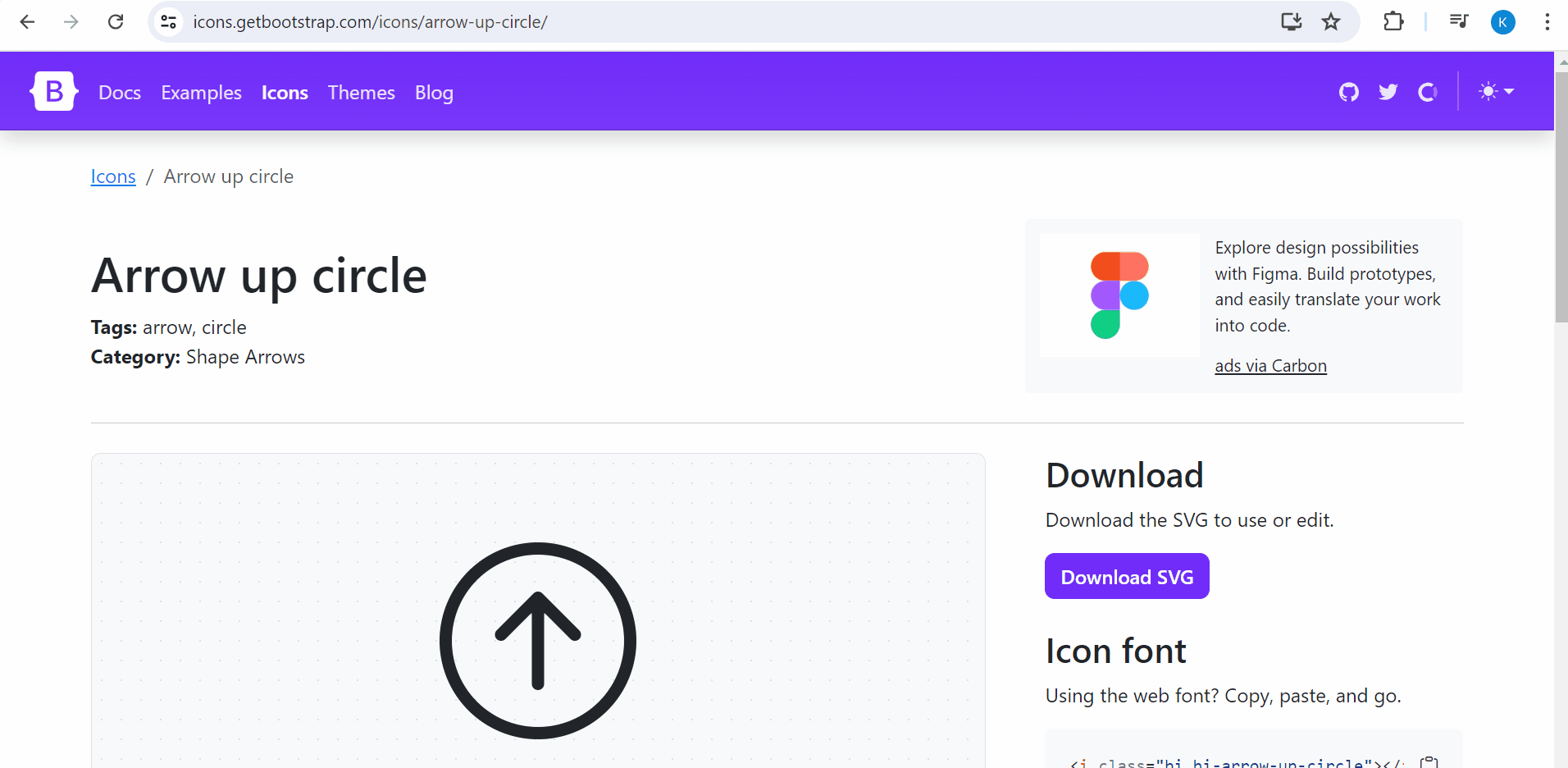
How To Import Icons In Bootstrap?
<i class="bi bi-arrow-up-circle"></i><!DOCTYPE html>
<html lang="en">
<head>
<meta charset="utf-8" />
<meta name="viewport" content="width=device-width, initial-scale=1" />
<title>Bootstrap Project</title>
<!-- import bootstrap icon and bootstrap -->
<!-- icon -->
<link rel="stylesheet" href="https://cdn.jsdelivr.net/npm/bootstrap-icons@1.11.3/font/bootstrap-icons.min.css">
<!-- bootstrap cdn -->
<link href="https://cdn.jsdelivr.net/npm/bootstrap@5.3.3/dist/css/bootstrap.min.css" rel="stylesheet"
integrity="sha384-QWTKZyjpPEjISv5WaRU9OFeRpok6YctnYmDr5pNlyT2bRjXh0JMhjY6hW+ALEwIH" crossorigin="anonymous" />
<link rel="stylesheet" href="style.css">
</head>
Icon link which will display the icon in the website
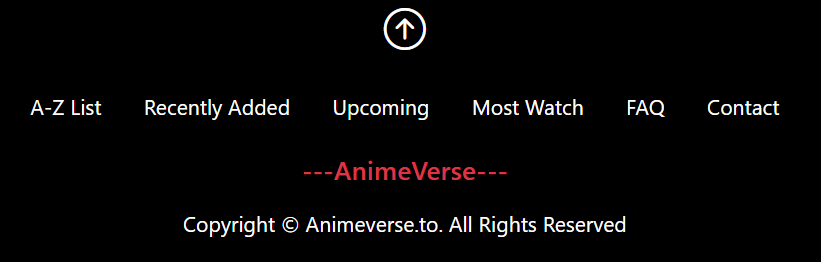
Let's See Footer In Action
<div class="text-center m-5">
    <a class="nav-link mb-3 hov" aria-current="page" href="#"><i class="bi bi-arrow-up-circle"></i></a>
    <ul class="nav justify-content-center">
        <li class="nav-item">
            <a class="nav-link text-white hov" href="#">A-Z List</a>
        </li>
        <li class="nav-item">
            <a class="nav-link text-white hov" href="#">Recently Added</a>
        </li>
        <li class="nav-item">
            <a class="nav-link text-white hov" href="#">Upcoming</a>
        </li>
        <li class="nav-item">
            <a class="nav-link text-white hov" href="#">Most Watch</a>
        </li>
        <li class="nav-item">
            <a class="nav-link text-white hov" href="#">FAQ</a>
        </li>
        <li class="nav-item">
            <a class="nav-link text-white hov" href="#">Contact</a>
        </li>
    </ul>
    <div class="card-body">
        <h5 class="card-title text-danger my-3">---AnimeVerse---</h5>
        <p class="card-text">Copyright © Animeverse.to. All Rights Reserved</p>
    </div>
</div>
Serves as a container for footer
Center the content horizontally inside parent container
Text
Applies 5-unit margin around the <div> for spacing between other elements
Text 1
Text 2
Text 3
Link that navigates to the top of the page
Styles the link to resemble navigation links
Margin bottom of 3 units below the link
Class for using hover effects
Indicates that this link is for current page
Links to the current page's top
Displays an arrow-up-circle icon from Icons library
Represents each individual item in the footer
Clickable links for various sections or pages
A-Z List
Recently Added
Upcoming
Mostwatch
FAQ
Contact
Sets the text color to white

A-Z List
Recently Added
Upcoming
Mostwatch
FAQ
Contact
Centers the list horizontally
<div class="text-center m-5">
    <a class="nav-link mb-3 hov" aria-current="page" href="#"><i class="bi bi-arrow-up-circle"></i></a>
    <ul class="nav justify-content-center">
        <li class="nav-item">
            <a class="nav-link text-white hov" href="#">A-Z List</a>
        </li>
        <li class="nav-item">
            <a class="nav-link text-white hov" href="#">Recently Added</a>
        </li>
        <li class="nav-item">
            <a class="nav-link text-white hov" href="#">Upcoming</a>
        </li>
        <li class="nav-item">
            <a class="nav-link text-white hov" href="#">Most Watch</a>
        </li>
        <li class="nav-item">
            <a class="nav-link text-white hov" href="#">FAQ</a>
        </li>
        <li class="nav-item">
            <a class="nav-link text-white hov" href="#">Contact</a>
        </li>
    </ul>
    <div class="card-body">
        <h5 class="card-title text-danger my-3">---AnimeVerse---</h5>
        <p class="card-text">Copyright © Animeverse.to. All Rights Reserved</p>
    </div>
</div>
Contains additional footer content such as copyright information
Contains title for footer section
With red colored text
---AnimeVerse---
Setting a margin of 3
Sets the font size to H5
---AnimeVerse---
---AnimeVerse---
Displays text for the card inside footer
Creates the text using paragraph tag
Copyright © Animeverse.to. All Rights Reserved
The Final Code In Action